Wednesday, 1 June 2016

Summit I Red: The Intercostal: 683

Review
01/06/16
https://intercorstal.com
https://www.kickstarter.com/projects/grthink/the-intercorstal-683

I've been lucky enough to see a preview of The Intercostal 683 by UK artist Gareth A Hopkins (see interview in Question Marks Won) and I can honestly say it's a breathtaking comic...

The Intercorstal 683
Gareth A Hopkins

You can look at the drawings of Gareth A Hopkins and think of the Italian Futurists – their fractured imagery and the irresistible sensations of movement and speed do indeed share a distant kinship with Gareth’s work... but, I prefer to think of him as Guinness!

You can read Gareth’s comics quickly and decide you know what he’s doing – you ‘get’ his point and it’s time to move on to the next luminous alcopop. But slow down. Take a moment to appreciate the complexity of what is in front of you and the dedication it took to bring it to you. Enjoy the layers and the flavours, and ponder the heritage they speak of.

I think it was Hannah Berry, author of Adamantine, who said that in comics every element matters – it’s all been put there by design (because, of course, previously there was nothing) and The Intercorstal is testament to how true that is. A noodly-doodly look belies the serious intent behind what is on the page and a liveliness to the linework means the intensity and detail never becomes ponderous.

But what IS it?

The Intercorstal is a five-strip, 32-page, black and white anthology comic. It’s also an exploration of the language and structure of comics through abstraction. It’s a welcoming experiment in alienation. It’s one artist’s playful idea made glorious reality through hard work and harder thought in pursuit of a singular vision. It’s a love letter to British weekly comics... written in purple crayon... by James Joyce.


So many silent, monotone, abstract pages should surely blur into one grey soup as you go through the book, but somehow Gareth has delivered page after vibrant page of dramatic tension and clearly demarked strips. If you can pace yourself reading silent pages, you will know when you’ve reached a clifhanger ending, and when you start the next story.

The astonishing confidence with which The Intercorstal deconstructs sequential narratives and reconstructs them puts the inflated claims from celebrated writers of Industrial Comics to be playing with deconstruction into perspective. THIS is deconstruction – painstakingly taking something apart and forensically examining it to see how it was put together, to understand what it was made from. Gareth is reverse-engineering previous examples of the form to make a new thing that looks nothing like its progenitor while unmistakably sharing the same DNA.

The result is a comic of story, rhythm and mood, that jettisons plot, character and text. 
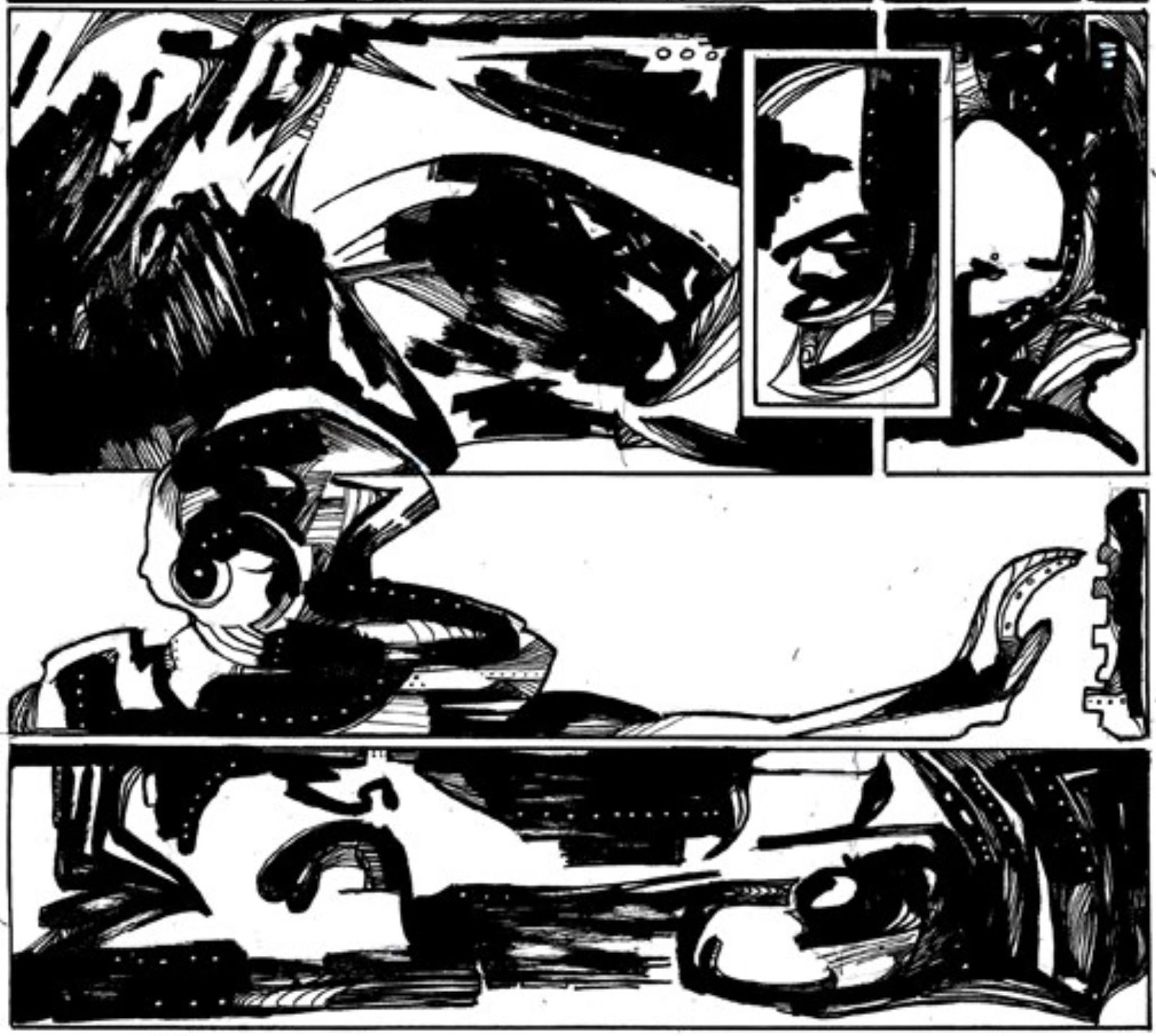

detail

Varied lines and solid shapes; gutters between panels; repeated motifs and very deliberate page layouts all combine to make a coherent, thoroughly readable object.

If reading 683 once will be a unique experience, reading it twice will be TWO unique experiences – the absence of literal figures or concrete meaning in the forms means the reader’s physical and mental circumstances change the perception of what they are seeing on the page. What we bring to this comic influences what we see in it and having read it once changes how we read it subsequently. Even reading on screen or in print will elicit different responses, so if you’re backing the current Kickstarter campaign, go for both for real value for money.

When I interviewed Gareth for the first issue of my Question Marks newspaper, he described himself as ‘an abstract artist whose medium is comics, rather than a comic artist creating abstract works and the distinction is telling. 

When I read silent comics my mind will often compensate for the missing sounds by inserting a percussive beat at each panel border... bum-tit; bum-tit... the edges dominate while the content and the page as a whole become more armature than structure. In 683 there is a flow between panels and pages, a togetherness to the package that pulls the reader into each part rather than pushing them out.

The drawings are eerily beautiful in their own right – if you like the work of Sergio Toppi, Mick MacMahon, Mark Badger or SMS/Smuzz there should be some resonance felt here. Many pages or panels could be displayed as standalone images on a wall (without the usual contextual dissonance inherent in sharing a detail from the whole).


detail

Speaking with Gareth, it’s clear how deeply he has thought about what he is doing here and how comfortable he is with making a ‘difficult’ experience for the audience when that’s demanded by the rules he has set himself for this project. But he is wrong about it being difficult – against all odds these pages are warm and human.

Without putting him on the same level, it's fair to say that in the way Blake or Braque explored classical themes through a combination of intellect and passion, so Gareth is exploring comics. It builds something whole and new from pre-existing material, retelling a old potboiler of story in an idiosyncratic manner to mine it for greater meaning on personal and universal scales.

Check it out and take your time to appreciate it all...

Cheers!

Places I Bin: The Drawing Circus – a second visit

Brighton Fringe Festival
23/05/16
In 2015 I was surprised that it had been 10 years since my last life drawing session.
This time it was 'just' 12 months – at this rate i'll be doing it daily soon!

So instead of last year's charcoal challenge, this time I drew in ink with a stump of bamboo and a wash brush pen thing... less forgiving of slips and mistakes and SO much more fun.

The show was similar to last year (see earlier post) with the same or similar songs sung and poses posed, and it was at least as much fun.

My one caveat is the poses were so short (between 2 minutes and 5 minutes then one slightly longer group tableau) which meant my rusty figurework didn't get much of a workout. It takes a while to get your eye in and see the anatomy properly with a nude – drape the model in diaphanous material, ruffs and jewellery and it just becomes a drawing problem too far for non-regulars lie me...

Below are a small number of the less embarrassing pictures I made.


Wednesday, 25 May 2016

My Stuff: Question Marks Won
a broadsheet newspaper exploring comics
12 BIG pages / £4.00 buy it here
25/05/16
Comments on the fist issue of Question Marks'


As an occasional print object, Question Marks is not set up for dialogue which is ironic as that is the purpose of sharing these comics and fascinating artists' thoughts with an audience, however compact and bijou that audience might be. There is no room inside for a letters column or proper discussion with readers, so we're trying an online version.

Please share any thoughts on ?sWON you like here, and reply to any other writers too. Opinions will not be policed, we're all big enough to behave properly, I'm (not so) sure, but trolling and meanness will get you deleted. Well, not YOU, but your posts...

So, one letter so far from Andrew Cocktoe in who's retrospective Past Live (buy it here) the inside back piece Internal Affairs first appeared:

Thanx for the contributor’s copy of Question Marks. From the consumer-friendly, possibly deconstructionist front cover to the enticing Nearlymade snip on the back it's an attractive proposition, if somewhat unwieldy (in the bath).

The substance of the paper seems to nicely underwrite your stated intention: to probe and  'take a serious look at other aspects of comic making - the philosophies  and thoughts behind...' in finely tuned and well thought out questions and answers. You might add to this an exposition and exploration of process that you are clearly fascinated and enthused by in your dialogues with the two creators showcased in this first issue. 

The strips featured are obviously in thrall with, and homage to, traditions: comics, and classical; graphic and literary. Tastily depicted, they  benefit from the magnification in print exposure over your newsprint pages. 'Internal Affairs' seemed to be about exploring other people’s anuses, rather than its own; hopefully.

And this kind of talk brings me to a slightly  more problematic area of the  project. The editorialising,  as somewhat rhetorical provocation while inviting debate, skirts and reflects an on-going, if often unacknowledged, challenge to comics criticism. 

For those of us who have spent much of our lives attempting to conflate the highbrow and the lowbrow there is something quease-inducing about projecting the language of the media studies academy on to our beloved art form of the Comic. Here, for example, we find terms  like 'Industrial comics',  'industrial comics artists'.  If these are  meant in the kind of descriptive, value-neutral light as 'Industrial Music' (yes, I know, you’re talking about the publishing industry..), they nonetheless come across as being used pejoratively. Would we not be better served by a differentiation such as 'narrative-based comics, and creators', particularly in the context of your interest in other artists 'playing and experimenting to bring us something new within the form'.  Gareth Hopkins refers to himself as an 'abstract artist whose medium is comics, rather than a comic artist creating abstract works'. I wonder what this means.

When fine art sensibilities are introduced into the realm of comics, I  question whether we are in danger of reintroducing that highbrow/lowbrow dichotomy into the very medium that has historically suffered at the hands and frontal lobes of such cultural value systems.

An equally large question for a number of periodicals both in hard print and online: should we be using literary critical or sociological languages or fine art criticism in the way in which we look at and examine comics, in order for them to be served and seen in a serious and culturally acceptable light? (presuming that is even our hope) 

What language would best serve the still relatively nascent (despite 300+ issues of the Comics Journal and a number of English language academic journals and courses) field of comics criticism? The projection of Leavisite literary criticism? Or the wholesale transposition of Ernst Gombrich's 'tradition with innovation' art crit principles onto Mark Cousins' 'Story of Film' (not at all dissimilar to the defining idea of T.S.Eliot’s 'Tradition and the individual talent' essay)? Or something like Paul Morley's history and traditions of pop music described in the shape of a city? ...

Your publication is astutely named. 

Perhaps I’m just being reductive and nostalgic when I recline in my metaphorical summer house armchair and view comics as a punky, mongrel medium running parallel to the so-called 'art world' as well as other media ('art comics' is another distinction I’ve seen elsewhere to describe work outside of the usual 'genres'. It's a term that seems, if nothing else, tautological ). 

Your first strip and Gareth Hopkins' subject matter rely heavily on unpicking the contours of the wider comic world. I think I also saw this suggested somewhere else not so long ago, but what of the notion of responding to others' comics in the comic form itself? Abstract comics art; abstract criticism?  What are those comics which pull others' works from whole cloth and project their own texts onto, again for example, doing? Commenting on, if not criticising in the normally understood sense of the term? Lichtenstein as numero uno comic critic? Art Spiegelman seemed to be getting at this in a number of his early experimenting-with-form comics pieces.

Question Marks, indeed. 

I think Andrew has misread my intentions a little, but in an interesting way. I will comment below... please join in.

SR


Saturday, 26 March 2016

My Stuff: Easter Egg
a recipe in comic form
15/03/16
Last Easter Original Boy (then 5) suggested a food experiment...
It took us 11 months to try it out because, frankly I'm no fan of chocolate and it sounded a bit dubious... but dang me if it's not a trash treat!


Let us know if you try it out. I may have the next celebrity chef in my house... 

Tuesday, 9 June 2015

My Stuff: Nearlymades
a smattering of found stories and kipple narratives
09/06/15
My new book of Pareidolia - NOW AVAILABLE
92 pages / Limited First Edition of 200 / £9.00 +£1 p&p 
buy it here or email to ask about review copies or wholesale prices


“Nearlymades is a fascinating recycling of found (and doctored) images. Bridging the gap between graphic novels and artists’ books, this rare and excellent example of abstract comics is intriguing, beguiling and witty, and will change the way you look at the streets around you.” - Alex Fitch, Panel Borders


Lying on your back, finding faces in the clouds. Walking home under yellow street lights and mistaking a bush for a lurking figure. Seeing Jesus in your toast.
You’d be a rare human, indeed, if you had never glimpsed a nearlymade! 

This hefty new book asks my (imaginary) audience to take a sideways squint at beauty in the detritus of the world. A mash-up of abstract shapes and peculiar objects to tease out ... something ... from a lifetime's immersion in art and fiction.


Some of the found comics and stories in Nearlymades will seem familiar – like half-remembered tales of martians, myths and monsters. And deja vu is always waiting in the shadows, but nothing in the book began with graphics aforethought.

Chance sequences and stories noticed on my travels have been collated and are presented here for a slower consideration.. On close inspection, what looks like a script may turn out to be a title or some verbal ruse to slow the eye and tickle the imagination.


The underlying conceit of Nearlymades is found images and words, twisted by my mistakes and obsessions while leaving room for a reader's own imagination. There are allusions and personal jokes that nobody will notice, but I hope there are connections and ideas that only you will see. Until you share them... which is kind of the point of the project!

Nobody was likely to publish this work, based on the description above, so I've gone ahead and made a 200-copy first print (with thanks to the efficient and helpful Rich at comicprintinguk.com). It's not completely a comic or an artist's book or a photography collection, so where to promote it is not obvious. Please do buy a copy if you think you'd like it, but also pass this on and let me know if you have any ideas of where I might talk about it - at the time of writing, 75 copies are sold or spoken for, but that's still a good number to try to get out there.

And, of course, if there are any publishers interested in a 'mass' market edition - drop me a line.

Wednesday, 20 May 2015

Places I Bin: The Drawing Circus

Brighton Fringe Festival
20/05/15
Is it REALLY that long (10 years!) since I last went to life drawing?
And even longer since the last time I drew in charcoal??

Drawing real people in real life is not the same as studying a pose and drawing in ink is NOTHING like using charcoal – so off I went to the Spiegeltent: Bosco Theatre for an evening of sketching circus folk.

Turns out they are 'just' people in costumes but because there is a story and they hold poses rather than tumble around, it's just what I needed to (start to) clear off some of that rust. A good looking troupe and a story and some cracking live music to help get the blood pumping while drawing. I loved it and will try to get to their events whenever I can from now on (regular sessions are on Thursday nights which sadly clashes with other commitments so it will be just the odd shows I guess).

Below are a small number of the less embarrassing pictures I made.


  TOLD you I was rusty!!

Thursday, 7 May 2015

Places I Bin: Graphic Brighton: Drawing in the Margins

Sallis Benney Theatre, University of Brighton, 58-67 Grand Parade BN2 0JY
01/05/15 and 02/05/15
Two days of academic talks on the subject of the marginalised voice in comics.
Good talks, good chats outside the talks and some good beers after the talks!

Friday night's Gay Manga panel (Emma Vieceli, Inko, Chie Kutsuwada and Ilya, moderated by Alex Fitch) was interesting in itself, but especially notable for how often the panelists had to return to discussing the definitions of different manga categories. Even 'gay manga' is too broad with numerous variations on the theme.

Quick Strips, which followed, was largely a forum for Myriad Publishing authors to talk through their recent projects, but a few of the speakers did step outside of 'precis mode' - particularly Hannah Eaton, Danny Noble and Fraser Geesin.


The comics dynamo that is Karrie Fansman was interviewed by Time Pilcher to set the tone on Saturday.


Muna Al Jawad, Corinne Pearlman and Julian Hanshaw shared a stage for 'Can't we talk about something more pleasant? Older people and comics'. Corrinne gave us an overview of representations of the elderly in comic form; Julian talked through the thinking behind his upcoming Tim Ginger book, which imagines himself as a septuagenarian; Muna described her method of using cartoons in workshops and had us pair off to draw 'a memory of an old person', which images were then discussed to tease out unspoken and unexpected attitudes to ageing. 


Ilya (above, looking more puzzled than sincere which was the sketch I was intending to make) and Nye Wright hosted 'Street Dwellers': a lively panel asking if the homeless have a voice in comics. Impassioned contributions from the audience – particularly Kate Evans on who owns an individual's story – made this one panel that stuck in the memory. I thought the two leads handled it with grace and compassion, even when challenged on the ethics of depicting real people without their permission or knowledge...

Bumps, Births and early Motherhood in comics and graphic novels (phew!) was very rewarding. I've enjoyed Francesca Cassavetti's personal memoir comics for a few years now and her fellow panelists Henny Beaumont and Kate Evans had me noting down there titles to seek out later.

A much stronger second year for Graphic Brighton. Running parallel streams of talks is frustrating when interests overlap, but demonstrates how much ground there is to cover. Most panels seemed to be recorded, possibly video'd, so hopefully they will be made available online soon through Graphic Brighton or the Panelborders podcast.

Bring on Year 3 – tentatively themed War (& Peace, following comments at the closing session, we hope) 

Thursday, 19 March 2015

Free to share: Solar Eclipse Comic

19/03/15

Tomorrow we are excited to see the solar eclipse, and I've been explaining to The Noisy Boys (5 and 3) about what will happen.

Original Boy (5) is starting to read, so I made this comic with Reception Class level text and now his school has asked for copies - which is nice.


Feel free to share and print as widely as you want - I'm putting this out under Creative Commons copyright license and there's a link to an A3 print-quality pdf below


Tuesday, 28 January 2014


My Stuff: Ditchling
27/01/14

I will get better at posting stuff this year.
Maybe.

Towards the end of 2013 I took The Noisy Boys (4 and 2) to Ditchling Museum of Art + Craft.
It was a lovely day out and the village is charming.

The museum itself – less so. After a long closure for renovation, what was once a well presented local museum with lots of information about the area plus a healthy dollop of Art & Crafts history has become an impressive building with a seriously one-note collection that skims the surface of Eric Gil and the A&C movement. It offers nothing for the initiated and too little to engage the uninitiated, but it is early days in the new life of a museum and it is to be hoped that the education and events programme give it some momentum soon.

Anyway, I drew this sketchbook comic about the village and Eric Gill...


Not sure how I feel about the work of Gill. Pretty certain how I feel about the man!

For that 3rd spread I shamelessly (and very badly) ripped off a pose from the marvellous Cindy & Biscuit comic by the unnecessarily good cartoonist Dan White. I feel worse about doing a bad copy of his drawing than I do any of Gill's work. That probably says something about both artists. Buy one, exploit the other for your typesetting with pirated fonts and think about the dogs...

Wednesday, 23 October 2013


Notes From The Lakes #1

Grants for the Arts: Individual Creators & Organisations

Sunday 20 October 2013

For those who did not go to the excellent festival in Kendal or could not make the workshop, here are my notes from a very useful session on funding:
     "The Lakes International Comic Art Festival aims to support creators and the development of comic art in the UK. As part of this we are pleased to be able to present a special session at the festival about the support available to individual creators and organizations from Arts Council England which will be run by David Gaffney.

    David is Relationship Manager in Combined Arts for the Arts Council in the North.  He will talk about how individual artists, arts organisations, and others can apply for Grants for the Arts lottery funding, covering what you can apply for,  how to make your application stand out, how applications are scored and appraised, how decisions are made, what match funding is required, and loads of other issues, along with invaluable tips on how to achieve funding success."

    • The Arts Council offers grants for the arts of between £1,000 and £100,000 - although government cuts have impacted on the high-end of this Lottery funding has increased so grants are not actually becoming harder to obtain
    • Projects/events must take place in England (although products may be sent abroad) and must be of identifiable benefit to people - if there is not an audience to engage then the project will struggle to get funding
    • From 2013 The Arts Council has split funding into two strands: for grants under and over the £15,000 mark
    • Most comic-related bids have a better chance if applied for in the Literary Arts category rather than the Visual Arts. Look up Relationship Manager, Literature at your regional Arts Council
    • There is a bigger pot under £15k and 60% of applications for funding are successful
    • Feedback on failed applications is not offered. but it seems Development Chats are possible before bidding and in advance of re-submitting a previously unsuccessful bid if you describe it as ' assistance to develop my bid'
    • Grants are intended to grow and develop artistic practices or to take arts to an audience - not for educational or commercial purposes, so don't overdo the 'teaching kids etc' angle
    • There are four criterion a bid is judged against - artistic quality; how it will engage the public; how it will be managed; the budget for your activity
    • More weight is given to artistic merit and management
    • At least 10% additional funding needs to be in place - but that can be your own salary expectations, or payment in support from third parties with an appropriate cash value
    • To emphasise that your project is growing the arts, any benefit in artistic development should be stressed - for yourself and any others involved in the project (including as many of your suppliers, consultants and advisors as possible)
    • There are many aspects of a project that can/should be covered in a request for funding - not just the production but research, mentoring, promotion etc
    • Do not cut your budget for payment to artists - The Arts Council wants to fund the arts not the managers
    • Be realistic with costs - if a similar project has been approved recently, it may be used as a benchmark to see if parts of your bid are priced much higher or lower and either may count against you
    • There is approximately a six week turnaround time between application and decision
    It sounds like a slow process of form filling, but with more small projects being funded than before, now would be a good time to knuckle down to some paperwork as long as you approach it in a business like manner. Proper Arts Council guidance can be downloaded here


    Good Luck!

    Wednesday, 29 May 2013


    My Stuff: Attack of the Demyelinator
    29/05/13

    Working with 'The Three Doctors' I drew a strip to illustrate their article on 'neuophobia' in the next issue of that must-read journal, Practical Neurology (well, it's a must-read for neurologists) 


    It's a fun project, turning highly technical medical terminology into a visual narrative and although I don't understand half of the text (or most of the subtext) it seems to make the medically-aware chuckle.

    The writers David Bargiela, Thomas Moon and Elisaveta Sokolov - are recently qualified doctors with a strong desire to pass on their knowledge in new and interesting ways. Along with their mentor Peter G Bain, they identified comics as an effective medium. It's been a great experience making the first strip cartoon for such a respected academic journal and plans are afoot for an ongoing series of articles-with-strips.

    Look out for these writers if you're at the Ethics Under Cover: Comics Medicine and Society conference in Brighton this July.

    Thursday, 23 May 2013


    My Stuff - Roy part 2
    22/05/13

    I GOT TRUMPED BY THE TATE'S RETROSPECTIVE

    I wanted to have a proper look at the process and practice of Roy Lichtenstein, but the pre-publicity for this year's big Tate show meant my comments would be lost in the greater debate (I hoped), but apart from the Image Duplicator show Rian Hughes has organised at Orbital Comics there doesn't seem to have been much consideration of the man's work. The conversation has been steered towards his celebrity and the weak controversy of his alleged theft of other artist's imagery.

    So, in brief, my own thoughts after looking at Lichtenstein's history and the big exhibition run something like this:

    • Lichtenstein's comic-based canvasses were a clever idea, but after a series of paintings/one show, any serious artist would have moved on to new ideas or to build a dialogue with his source material and his audience. To continue in the same vein for so long should bring his credentials as an artist into question and suggest that he was more a producer of merchandise.

    • The man himself did not plagiarise comic-books, although he did copy them clumsily without acknowledging the original artists – even when confronted with their identities.

    • Any criticism from cartoonists of Lichtenstein gets dismissed as financial jealousy by the wider world, and if their claims were ever taken seriously they would quickly be derailed by the observation that the cartoonists he copied were working in a field where it was common practice to base drawings on previous cartoonists' work or clippings from other media. This doesn't make his activities ethical, but it does make the outraged reactions to him easier to dismiss.

    • The critics who champion Lichtenstein (David Sylvester aside) tend to be lightweight arts writers with little significant writing behind them – Alistair Sooke for instance, who wrote the book of the current exhibition and presented the tv documentary preview is an art critic for the Daily Telegraph with a leaden approach that focuses more on the fame or notoriety of a work than any intrinsic merit. The art critics who talk about him at all either over reach ("I Can See the Whole Room … quotes abstract expressionism – the image suggests such seminal works as Kazimir Malevich's 1915 Black Square – while entirely subverting its tone" said Sarah Churchwell in The Guardian!) or concentrate on his novelty value, which was surely played out the first time an art student mimicked his paintings to promote a student union gig.
    • The commercial nature of the fine art world will naturally insist that any high-priced works are high art. There will never be anything permitted within that bubble that might argue seriously against the status (read: value) of the works. It's noticeable how the original sources for Lichtenstein's works are always referred to as 'commercial artists' without distinguishing how his work was every anything other than commercial.

    • My own criticism of Lichtenstein is simply that he was not very good (as opposed to not being successful) at what he chose to do. He had one  good idea, but the mediocrity of his craftsmanship undermined the work and the paucity of his imagination prevented him taking the idea anywhere beyond the surface. There are no convincing dialogues with previous, contemporary or future artworks in his paintings – just the same monologue repeated over and over again to diminishing effect. Lichtenstein, more than any other 20th Century artist, is frozen in his own perfect pregnant moment. Without the commercial value of his work, he would be a curious footnote in the story of art. None of his work at the Tate has anything to say to later generations as it was long ago assimilated by the rest of the world – he is visual art's equivalent of the miniskirt: shocking at the time but quaint within a decade.

    AT THE TATE
    • Lichtenstein's 1958 ink drawings Donald Duck and Mickey Mouse 1 are a curiously harsh look at two cultural icons. Unlike his famous paintings, there's a strong indication of the artist's hand here as with his first few 'comic panels'. These are both signed – as was his first recognised  comic painting, Look Mickey – which undermines the amateur apologist's defence that 'he didn't sign his paintings so why should he put anyone else's [i.e. the cartoonists he appropriated] on them?'

    • I had hoped that the scale of Lichtenstein's work in the context of a serious retrospective would lend previously unseen weight to his imagery, but of all the paintings on show, only the Rouen Cathedral set (three pictures based on the work of Monet) are particularly effective. The viewer can lose oneself and the image in a blur of colour as one approaches these canvasses – this is true of the original Manets, of course, but exaggerated here to dramatic effect. These pictures would make for great public art or marketing in a passageway. 

    • The other fine art appropriations presented fail on almost every level. Often distinctly amateurish in execution and showing a level of aesthetic decision-making on a par with decorating tips one might glean from a home makeover show. 

    • As with the cartoons, there are no attributions in labelling the images based on paintings. It seems that for the critics and the gallery, Lichtenstein's work uniquely exists in a vacuum - apart from the cultural and artistic legacies it trades on.
     
    • Surprisingly, the comic paintings don't gain any significant impact from scaling-up. I had expected them to have more 'oomph' after having seen them reproduced in books (etc, etc, etc). This was a noticeable distinction for me between Warhol's work and the mass-market presentation of the same, but in Lichtenstein's case bigger makes very little difference. 

    • His adjustments to compositions (seized on by critics as evidence of his artistic genius) are usually a case of not pushing far enough to develop whatever ideas he had of a "removed, technical almost engineering drawing style". And they hew too closely to their sources to effectively comment on any wider issues than an artist's predictable interest in the 'pregnant moment'. On the whole, Lichtenstein's changes to his appropriated artworks are considered but clumsy to the point of often seemingly arbitrary. Lacking subtlety, they demand serious attention to the compositions' potential connections/abstractions/contradictions, but the artist has been satisfied to crudely mix and shuffle elements of pre-existing works without adding anything new. 

    • The best that may best said for these pictures is that they are bright and decorative and the act of showing/selling them was provocative in the 60s. They are a historical curiosity that will satisfy the craft shopper but have little to offer a student of the form.
    • In a rare break from his habit, Lichtenstein's 1988 painting Laocoon features actual brushmarks. Like the Rouen images, this teasingly hints that the artist could have taken his idea forward into new and challenging territories, but he seems to have fallen back into the same tired commercial schtick soon after.

    • Lichtenstein's sculptures and Chinese landscapes (lauded by many visitors  and commentators purely for not being something they were previously aware of) are definitely preferable as decoration to similar works for sale in my local garden centre.
     
    • The mirrorsself-portrait and Interiors 'studio' of the 70s actually do something with the Lichtenstein style – showing a world from a specific perspective – and I have to say they do it rather well.

    • While the bulk of his work tends to elicit a jaded, nostalgic smile, the late nudes series is fun and potentially raises actual questions in the viewer (for me, accidentally sending criticisms through time of the sexualisation of children's comics prevalent today). If Lichtenstein had shown any real awareness of the comics industry, they might be considered a call back to the tales of cartoonist Jim Mooney drawing all his figures naked and adding costumes only at the inking stage of his process... but obviously they are not even as deep as that in-joke would be. They are merely another spin on an old idea. Which sums up Lichtenstein's oeuvre quite neatly.